Kansas City's historic Westport neighborhood is hip again
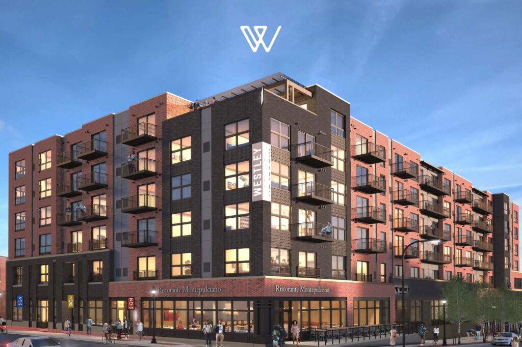
UpShift partnered with Opus and Willow Bridge to create a brand for a luxury residence in Kansas City’s Westport area.
Westport was once the gateway to the west—its brick streets have ruts from heavy wagons. Opus was investing heavily in the emerging area but they sought to maintain the neighborhood's character. So they hired UpShift to create an innovative brand, complete with authentic collateral, signage and a custom website that appeal to the eclectic community while attracting new residents. Our website won Gold at the Horizontal Interactive Awards and led to record-fast lease-ups.

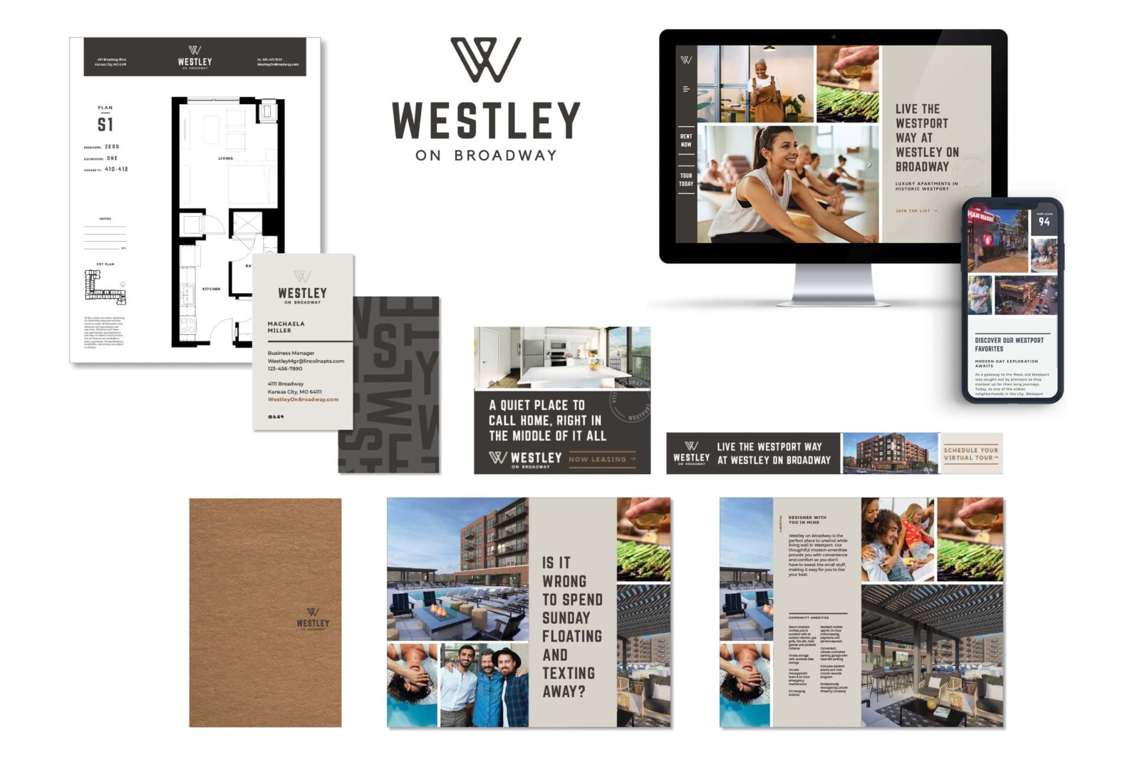
Westley on Broadway references the Westport area in a creative way. As a first name, it sounds friendly and welcoming and is also a bit of an older-sounding name that hints to the area's historical roots. For the logo, we chose an industrial, condensed, squared-off font that is bold and impactful, much like the design of the building. The W icon has soft and rounded edges to match the typography and has a stamp-like quality.
The Westley on Broadway is a custom-built website with a RENTCafé integration. There is an overall industrial and clean vibe, with a minimal color palette using pops of warm tones which reflect the interiors.
Promotional marketing items are a great way to feature the brand and logo recognized out in the community. Shown here, a tote bag, coffee mug and coasters are a great way to showcase the Westley brand.
A custom folder was created with slits to hold the brochure and business cards as well as any other information the leasing team hands out to a prospective resident.
Floor Plan sheets created for each floor plan type to be handed out to prospective residents. The size fits perfectly in the 9x12" folder.
Business cards were created for the team at Westley on Broadway. The backside utilizes the mixed letter pattern that was created for the brand.
A simple and clean thank you card was designed for the leasing team to send out personalized notes.
The brochure is a unique format with interior pages bound together with a metal clip. The exterior uses a suede-like stock for a deluxe, tactile feel. In the interior, smaller textured sheets draw your attention to the fun & cheeky brand messaging, which reflects the building's personality and demographic. The small 6x9" size makes this a perfect marketing handout that is easily transportable.
The e-news template is designed and created in Mailchimp for the marketing team to utilize after the brand launched.
Exterior window signage was created to draw attention to the brand and announce leasing. The design features the logo, fun messaging and lifestyle imagery that reflects the key features of the building.
Interior signage designed to be clipped into cords installed from ceiling to floor, for an upscale look. One board highlights the locations of apartment types throughout the property, another showcasing amenity renderings, and the last highlighting the building amenities.
A 6x9" handout highlighting the building's offerings.
Social Media accounts were set up to increase visibility across platforms.
Animated and Static ads were created to bring traffic to the website for lease up.