An Authentic Brand in the Chicago Meat-Packing District
Marquette Companies sought UpShift to brand a 14-story, 263-unit luxury rental community in Chicago’s West Loop, specifically in the Fulton Market neighborhood.
We created a compelling brand for The Mason that resonated with the area’s history while appealing to modern renters. Our unique marketing strategy led to record-fast lease-ups and top rents, successfully expanding the “western edge” of the West Loop beyond Ashland Avenue.
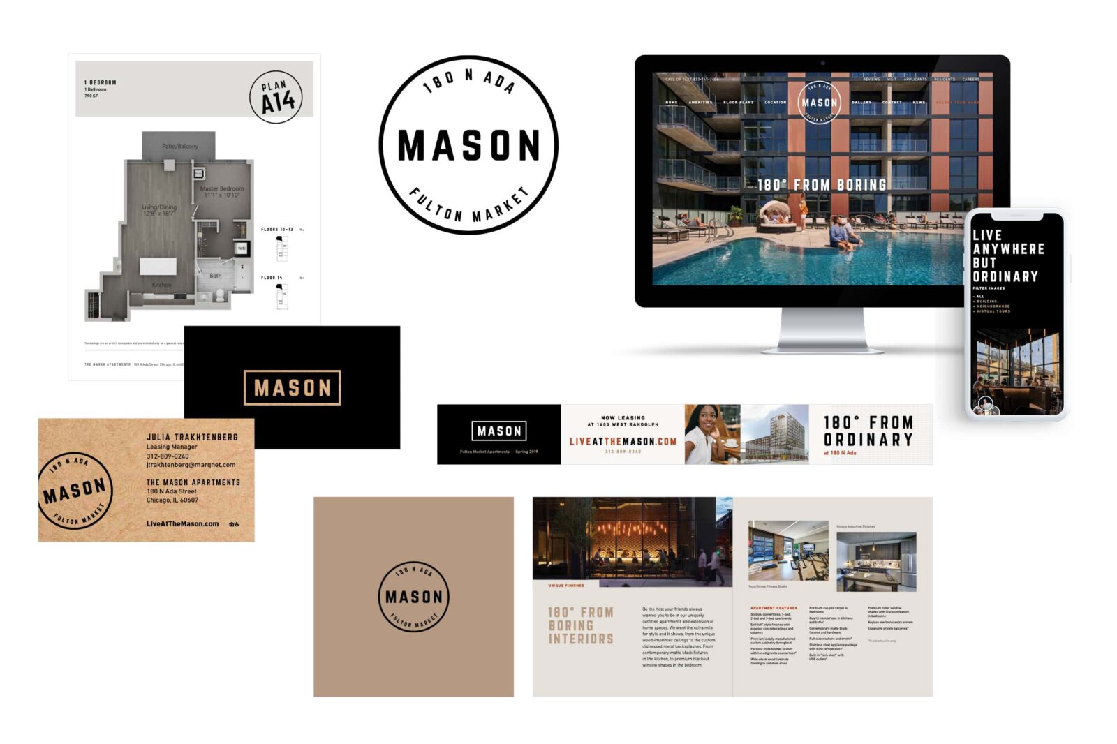
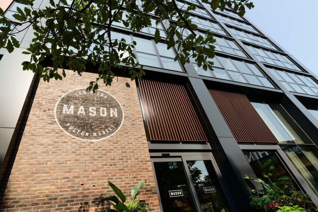
Located in Chicago’s Fulton Market, The Mason name was derived from the rich history of masonry work in the area. Brick masons were a fundamental part of Fulton Market’s architectural history as they literally laid the foundation for the many brick facades that still stand here today. The logo typeface, with industrial details and a combination of sharp and rounded shapes, emulates the masonry craft. The addition of of the location within the seal highlights the desirable Fulton Market location right away.


The Mason is a custom-built website that continues to communicate an industrial, clean vibe, with a minimal color palette using pops of brick red and warm tones which reflect the interiors, and unique features that highlight key amenity spaces and services, along with the incredible Fulton Market location.


The website also features a custom data integration with Yardi's Rent Café, which allows for prospective residents to see an accurate live view of available apartments and pricing without linking out to a separate site. Where most property management sites only offer one way to search for an apartment, our product features a thoughtful user experience (UX) to address multiple renter personas. Users can search for an apartment by either floor plan view, or list of all available apartments based on target move-in date.

Floor Plan sheets and Letterheads were created for each floor plan type to be handed out to prospective residents. The size fits perfectly in the 9x12" folder for residents to easily keep safe. The business cards utilize a butcher kraft paper stock authentic to the Mason's meat packing district, and memorable when handed to clients.

A custom folder was created with slits to hold the brochure and business cards as well as any other information the leasing team hands out to a prospective resident. A large image on the inside panel showcases the stunning rooftop terrace on The Mason.


A custom square brochure was designed for prospective residents to take home with them. Brick and kraft paper textures are mixed in throughout with photos and messaging that tie nicely into the neighborhood and appeal to the younger demographic.

A 6x9" handout highlighting the building's offerings.

Construction signage was created to introduce the brand and announce leasing. The design features the logo, creative brand messaging and lifestyle imagery that reflects the key features of the building. The 180° messaging is highlighted throughout, cleverly nodding to the buildings address.

The logo can easily be applied to a variety of items that can be shared with residents at events and promotions.

Social Media accounts were set up to increase visibility across platforms, and UpShift worked to create content across various platforms after opening. From Resident Events to Amenity Features, The Mason brand was carefully carried out throughout through including graphics and and a voice that reflected our clever messaging for the brand.